
Explore Mind Boggling Articles.

I got my first iPhone in 2013, and it changed my daily life in a number of ways: I had music on my phone, I could easily Google things like “what exactly is rice?”, and I had a significantly better camera at my disposal. I casually overlooked my newfound ability to see the weather via Apple’s Weather App.
Prior to my first iPhone, when I wanted to know the weather, I watched the news, asked my parents, or assumed what I should wear based on the time of year. Now, I wake up to a notification with the weather for the day.
As an aspiring UX designer, I wanted to take a closer look at the Weather app. The people who designed it have succeeded in making a joyful and intuitive product that is easy-to-use for a wide range of people. Even a young child can look at the rainy sky animation at the top of the screen and know that they may need their rainboots and jacket before they leave for school. Other users can scroll down to find information about air quality, the time of the sunrise and sunset, wind speed, what it actually feels like outside, humidity, visibility, pressure, and even a high-resolution radar map.
In this article, I will explore how the Apple Weather App organizes a wealth of information in a manageable way using the Gestalt principle of common region and Jakob Neilsen’s 8th heuristic, Aesthetic and Minimalist Design. By studying the Apple Weather App in relation to these principles, I’ll show how designers can create more organized, beautiful products and services of our own.
The evolution of Apple’s Weather App
The Weather app has changed a great deal since the original iOS. In particular, iOS 7 made notable changes to the app with the introduction of the animated, rather than static current weather display at the top of the screen (see Figures 2 and 3).
In 2014, Apple changed the data source for their app, replacing Yahoo with the Weather Channel. This altered the app’s design with new icons and features like pollen forecast, a description of the forecast, and exact hours of rain.
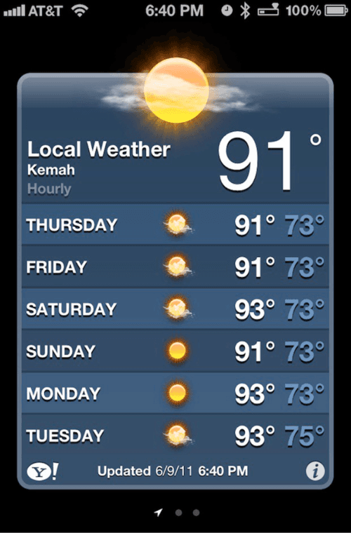
Figure 2:
iOS 5 Weather App. The display is static and does not include hourly changes in weather.

Figure 3:
iOS 7 Weather App. It features an animated display of the current weather, hourly temperatures and more information if you tap on the top.

Figure 4:
Here's what Apple's Weather app looks like powered by Yahoo (left) versus The Weather Channel (right). The icons for the weather are different and there is a description of the forecast.
Another big change came about in 2020, when Apple acquired Dark Sky, a well-loved hyperlocal weather app with minute-by-minute forecasting. On their website Apple explained, “ Apple Weather [now] offers hyperlocal forecasts for your current location, including next-hour precipitation, hourly forecasts for the next 10 days, high-resolution radar, and notifications.” According to today’s App Store preview, the Weather app allows you to see current and forecasted weather, “precipitation, air quality, and temperature maps” near you and at other locations.
#1: The Gestalt Principle of Common Region
The Gestalt Principles (of Visual Psychology) are a set of ten principles that describe how human perception works, specifically how human beings perceive groups of objects. The Principle of Common Region or Unified Connectedness says that elements that are visually connected (or contained in another shape, line, or frame) are seen as more similar. In Figure 5 you can see a clear example of this Principle. When you look at all of the identical circles that are spaced out evenly, you are likely to view the circles in blue as being connected.

Figure 5:
The boundary around the three middle circles in this graphic makes them appear related and as part of the same group. Via Nielsen Norman Group
Let’s look at how the weather app is able to see this principle in action. In Figure 6, the top section shows the hourly temperature and a simplified icon to indicate weather. Within that group, the temperature and weather icon are grouped using proximity rather than another boundary. The overuse of lines and proximity can lead to a cluttered view of an application as seen in Figure 7. This can be avoided by using common regions to connect elements.
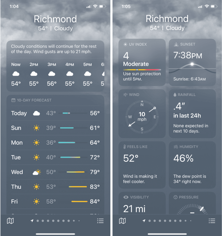
Figure 6:
Weather app iOS 16.2 uses the principles of grouping and proximity to indicate which information goes together. The principle of grouping can be seen on the right side with the rectangles around each set of information. The principle of proximity can be seen in the hourly information displayed with the icon, temperature, and time close together with a space between each hour.

Figure 7:
AccuWeather does not use containers to separate information.
In contrast, there is a limit to how much this principle should be used. If the app were to create those boundaries around every single small group, it would be too cluttered. A clear example of this can be seen in Figure 8.

Figure 8:
The filter menu on the Backcountry.com mobile website displays each filter category within a bordered box (left). These groupings are evident without the borders (right) and allows room for more content.
In the case of the Weather app, the Principle of Common Region also creates a reliable pattern which makes it easier for us to scan and find the information that we are looking for. In Figure 9, you can see how UV index, sunset, wind, rainfall, “feels like”, humidity, visibility, and pressure are all displayed on a single screen. They are easy to scan and digest because they are each contained in a clear boundary with a heading.

Figure 9:
iOS 16.2 Weather App uses clear boundaries to separate information.
In your own practice, you can utilize the Gestalt Principle of Common Region to show a connection between elements, organize your pages or screens, and create clear patterns. The Weather app uses gray boxes, but there are other options, such as:
Connect related links or buttons by adding them to the same drop-down menu.
Use the same bullet shapes, colors, or numbering system (such as Roman numerals, Arabic numbers, etc.) on list items to group them with each other.
Display functions of a similar nature, such as login, sign up, and forgotten password, so that they are related, inside a frame or colored rectangle.

